2014 Football Top Scorers

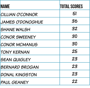
Below is a list of Top Scorers from the 2014 Football Championship. While it is a fun table to look at at the end of the year, the format of the Championship makes the Top scorer an odd measurement of performance. After all you need to be a good forward on a good team to have any chance of making this list.

Top-Scorers-2014

Cillian O’Connor had a great year but he played New York and 2 games went to Extra Time, so his opportunities to score were quite high. A very simple way to evaluate forwards is based on their time on the pitch. The table below simply takes the Minutes Played by each forward and divides by their total score. This gives us a new calculation of Minutes Per Point. So on average how many minutes did each player ‘need’ for each score they got.

top-scorers-mins-per-point

  • Sean Quigley jumps to top of the list with a very impressive Score nearly every 6 mins of play.
  • Cillian O’Connor really did have a phenomenal year. Even removing the New York game leaves him at the #2 spot with a Mins Per Point of 9.35
  • Michael Newman doesn’t make the Top 10 scoring list but appears here at number 5 with a score nearly every 11 mins.
  • Also worth noting that there are only 3 All Stars on this list, perhaps some data might help when they pick the 2015 list!!

It’s not a perfect measurement but does offer some additional context that the raw scoring chart fails to pick up.

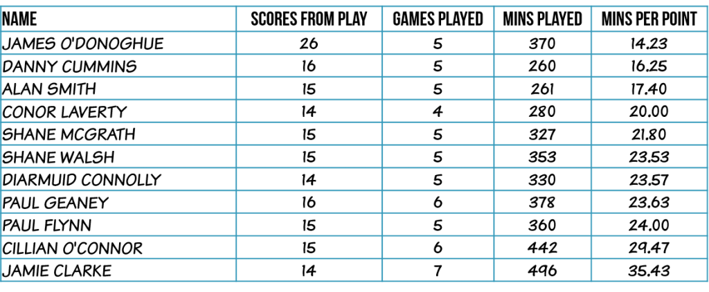
*Update – Below is the Table just counting scores from play.

top-scorers-mins-per-point-play

Comparing Football Forwards

It can be hard to rank forwards in any meaningful way. Teams play such a diverse range of opponents and styles that simply looking at Total Scores or Shooting % can be a bit misleading and counter-productive. I wanted to look at a way that would allow for a better comparison of forward play, accounting for both their style and efficiency from play. Copying some of the techniques used by Kirk Goldsberry in his much acclaimed Basketball paper we can come up with some nice and simple techniques to achieve this.

shooting-splitsThe idea is quite simple. Break the ‘scoring zone’ into 3 very distinct areas.

Close Range: 30m arc around the goal

Mid Range: 10m arc around close range

Long Range: Any zone not included in the above.

The image on the right shows what this looks like overlayed on a pitch.

Within each range we can look at two things.

  1. What % of shots does forward X take from each zone. This is called the Frequency Split. 
  2. What is forward X’s Shot % (Scores/Total Shots) in each zone. This is called the Efficiency Split.

The table below shows both the Frequency Splits and Efficiency Splits for 4 marquee forwards.

4shooters-table-efficiency-frequency

To take Bernard Brogan as the example.

  • In terms of shot distribution, Bernard Brogan took 59% of his shots in the Close Range, 31% in the Mid-Range and only 9% from Long Range
  • In terms of shot efficiency, Brogan shot 48% from Close Range, 35% from Mid-Range and 36% from Long Range – ‘surprisingly’ below average (of top 20 shooters) in the Close and Mid-Range zones.

By contrast we can see that Michael Murphy shoots 60% from the Close range but only takes 33% of his shots from that zone. This reflects a very different type of forward. Murphy’s role is much broader than Brogan’s and this is reflected in the Frequency Splits. All other things being equal, if Murphy was getting the same shots as Brogan we would see a 12% higher conversion rate.

Obviously the standout forward in terms of efficiency is James O’Donoghue with 70% from close range and 53% from Mid-Range. The fact that he takes such a large amount of shots within the Close-Range helps a lot and should worry any opposition. I have less data for  O’Donoghue than other players and it will be interesting to see how he gets marked in 2015, but looks like you won’t find him taking many shots from +40 meters.

Cillian O’Connor had a phenomenal year this year and his numbers are impressive in the Close-Range, but push him out a bit further and defenders might see a bit more joy as his return dips below the average.

Conclusion

This method allows us compare styles through the Frequency Splits. This differences in playing style can be dictated by the player themselves or the management but either way it offers us hard of evidence of just how different these 4 forward are. Combining the frequency and Efficiency splits allows us compare different forwards given similar shooting opportunities. Perhaps surprising is that Bernard Brogan is below average in the Close and Mid Ranges. There is obviously more to his game than just shooting, but given the same opportunities the average forward would convert more often. Murphy’s role is also intriguing, no doubt he offers something anywhere he plays but, based on these figures, it’s quite obvious how devastating he is close to goal.

Would be interested to hear your thoughts….


* Data is based on 180+ games covering League & Championship from 2011 – 2014

Peak Age of a Footballer

All sports have a peak age but what is the peak age of a Gaelic Footballer?  Ideally you would look at game time per squad for the last 10 years, but that info is simply not available. Maybe one day!

One possible way is to look at the age at which a player was when he received an All Star Award. Now I know the All Star’s have their detractors and results would show that it favours the All Ireland finalists more than it maybe should, however it can be used to see what age the ‘best’ players are.

Gathering the list of All Star Winners since 2001 (start of qualifiers) and matching to their DOB (or at least year of birth) it is possible to see the peak age at which players receive an All Star. As you can see in the graph below. The peak age is 25, with the Average Age being 26.

all-star-winning-age

Odd that the 26 bucket has a few less than 25 & 27, but it’s not a massive sample. What is clear is that there is a big uplift once players reach the age of 23 and starts to drop off after 27. So it’s fair to say that based on this players start to play their best football at 23 and their peak performance will last until 27. There will always be exceptions to the rule but it is interesting to see a clear pattern.

It would be really interesting to see if this Age has changed over the decades? Is the peak age much younger than it was 20 or even 40 years ago? Work for another day.

Average Age of Squads

I wanted to see how the All Ireland Semi-Finalists stacked up against the peak age effect we saw. Do these teams have an average squad age of somewhere between 23-27? Well the Answer was hard to believe.

semi-finalisits-2014-average-squad-age

All 4 squads have exactly the same average squad age of 26 – the average age of an All Star! This is 1 year so it might have been a fluke but… If there are other teams out there with ambitions of challenging for Sam in 2015, it will be worth looking at their squads, will they have enough players in the peak age bracket and more importantly are those players any good?

Averages can hide a lot of variation and there are different ways to measure this. Donegal have the biggest variation in ages, despite the fact that they have an average of 26 the spread of ages is much bigger than in other teams. But what about Kerry’s ‘old’ squad? Actually not so, there spread of ages is very similar to Dublin’s. These figures take into account the entire squad rather than the starting 15.

Position Specific

When we breakdown the figure by position we do begin to see bigger differences (graph below). As you would expect GK’s peak at a later stage than any other position, but still under 30 which might be surprising.

all-star-average-age-position

No surprise that the FB and FF line are the young guns. Speed is probably king here, so age is on their side.

The half-backs and half-forwards peak slightly later than the full-back and full-forwards but there is really not much in the differences between positions.


Gaelic Football World Rankings

Most sports around the world have some sort of ranking system. It’s not a new phenomenon but has some real merit in Gaelic Football. The team that lifts Sam has achieved all they need – but how do you asses all the other teams that have competed. New managers come and go but have they improved the team?

The structure of the GAA season does not lend itself to direct comparison from year to year. However if you develop a clear ranking system for teams you can assess how 1 team has done year on year. Good or bad has the team improved?

There is an explanation of how the system works at the bottom of this page, but it is based on a very similar system to FIFA world rankings. Points are awarded for a Win or a Draw with additional weightings being added for the Competition, Opposition Ranking and Historical Weighting.

Here is the 2014 Table as of 18/09/2014 – This will change with 1 game to go!

2014 Table

world-ranking-2014

Historical Table

Want to see how teams have moved up and down over the last few years? Check out this historical table.

historical-world-rankingWinners and Losers

  • 2009 is based on just 1 seasons worth of games – so it is best to concentrate on the later years where more data gives a better picture.
  • It is clear to see the effect Jim McGuinness has had on the Donegal Team. Ranked 19th at the end of 2010 they have yet to finish outside the top 4 under his stewardship.
  • The other big movers are Monaghan. Since Malachy O’Rourke has taken charge they have climbed from amongst the worst ranked teams into the top 5.
  • It might be surprising to see in 2011 for example that Donegal finished 1st and Dublin 2nd but there were more points available for Donegal as they were coming from a much lower base.
  • Armagh look like one of the most inconsistent teams. But 2014 has seen them break into the top 10 for the first time.
  • Derry can feel a little hard done by –Despite 2 successful league campaigns in 2013 and 2014 they have really failed to inspire in the Championship, hence the low ranking.

I’m sure it will create plenty of discussion – no system is perfect but it’s as objective as any system in determining how well a team has done over the years. And remember this is just a bit of fun!

Ranking Explanation

So how does it work?

This is based heavily on the system FIFA use to rank International Football Teams and works like this.

100*(Result x Match Status x Opposition Ranking x Historical Weighting)

Result Explained;

Win = 3

Draw = 0

Loss = 0

Match Status Explained;

Not all games are created equally to we apply a weighting to each game type.

Championship Game = 5

Qualifier = 3

League = 1

This makes a championship game 5 times more important than a league game. Most teams are judged on their championship form so I think that gap is justified.

Opposition Ranking Explained;

At the end of a season teams are ranked 1 – 34 – this ranking forms the basis for the Opposition Ranking in the subsequent year. This means beating a team ranked higher will get you more ranking points than beating a team of lower ranking.

Historical Weighting Explained;

The results below cover games played between 2009 – 2014 (15/9/2014). Each season is weighted so that results in 2014 are worth more than in 2013 and so on.


Home Advantage & Regression Towards The Mean

This is just a very quick follow up to yesterdays post. Call it hedging my bets – but this is an important concept. When calculating home advantage in the qualifiers between teams from the same division it turned out that home teams win 81% of the time (16 games). In Gaelic Football terms 16 games is about a quarter of a season so it does seem relatively big but in reality 16 games is tiny. There are just too many other factors (ignoring home advantage) that could be at play in such a small sample size.

So how accurate is the 81% figure. Well it definitely tells us what happened in the past but can it be used to predict the future? The one big thing that tells me this figure wont stay this high is that when we look at all the studies on home-field advantage across any number of sports we almost never get a figure this high. Could home-advantage be that important in GAA – I can’t see why it would be any different to American football, baseball or Basketball. In fact when we look at League home advantage in each of the 4 divisions separately we don’t get close to these numbers.

There is a concept in statistics called regression towards the mean. In any data set you would expect to see fluctuations. Even if you toss a coin it will not always go Head-Tails-Head-Tails etc… You might get a run of heads and then a run of tails. Getting a run of tails after a run of heads is not unexpected, as such, its just that if you toss a coin for long enough you will eventually end up with 50-50 split. A run of heads or tails is likely just the data regressing toward the mean.

So what has that got to do with home-advantage. Well 80% seems unnaturally high, not unlike a run of heads. So without predicting which matches will go which way, or even if we will see the regression start this weekend, I would expect home advantage % to return to a more normal level. So for any punters, don’t just blindly back the home team this weekend.

Home Advantage in the All Ireland Qualifiers

Home Advantage in the All Ireland Qualifiers

Quite awhile back I looked at home advantage in Gaelic Football. You can read that piece here. It found that there was home-field advantage in the league but proved very inconclusive in the Qualifiers. Unlike in the league where teams are grouped together based on their standard (form), the qualifiers are an open draw and can pit teams of very different qualities against each other. This has a tendency to skew the data and might mask any underlying home advantage. For example if Kerry were drawn against Leitrim, away from home, there is no way the home advantage would make up for the gap in quality.

With that in mind I decided to look at home field advantage in the qualifiers while taking account of the difference in quality between the two teams.

A note on the data:

  • It includes all qualifier games played on non-neutral grounds.
  • Season 2008 – 2012 as that is when the league went to 4 divisions.
  • This left us 93 games played in a home venue

The Results:

Click to Enlarge
Click to Enlarge

Thoughts

First thing to note is that since 2008 home-advantage does have an effect – regardless of the quality of the 2 teams involved. That in itself is noteworthy. However the results get more interesting when we allow for the similarity in quality between the 2 teams. When the difference between the 2 teams is greater than 1 division i.e. Div 2 v Div 4 we see almost no advantage in being at home. The results are closer to 50-50 which is probably linked to the odds that a team will be drawn home or away (50-50).

As the quality of the teams get closer we begin to see a seemingly bigger advantage to being drawn at home. Where teams are from the same division or only 1 division apart home teams win 60% of the time.

The home winning % of teams when they play opposition from the same division is a startling 81%!! This has only happened 16 times since 2008 and only once between Div 1 teams but that is a big number.


*Authors Note: The sample size is relatively small but if we let that stop us doing analysis on GAA we could never analyse anything! 

Agenda Stats

Often people seek out stats that already agree with their own opinion rather than look at ALL the facts.

Colm Parkinson has a problem with GK taking frees and how much time it takes up. His recent tweet:

What do the facts tell us;

17 frees were taken where a genuine effort was made at scoring. 6 were taken by the GK’s & 11 by outfield players. If we look at the averages of the time taken from the free being awarded to the ball being struck.

GK’s AVG; 49 seconds

Outfield AVG: 34 seconds

So GK’s took an extra 90 seconds out of the game than outfield players (15 sec x 6), but that’s assuming it should take the same time to take a free from 45m or further as it does from 13m. I’m not sure this is the case and perhaps over the summer we will get a better idea on this. One thing is for sure they did not waste 5 minutes of the game!

Tyrone v Dublin League Final Preview

Despite only 1 point separating them over the course of the league, Dublin are firm favourites with the bookies for Sunday’s League Final. Taking into account that Tyrone have already beaten Dublin this year is the short price on a Dublin win justified? Let’s take a look at some of the numbers.

Tyrone:

Tyrone’s Shooting % in 2013 is at 47% – not bad but certainly not brilliant. Come Championship time this probably won’t be good enough to lift Sam. What has helped Tyrone is the fact that their opponents have only shot at 42% (Dublin scored 48%). This is a pretty low % and again not something we would expect from Top Teams but some credit must be given to the Tyrone defense for this.

To highlight how good Tyrone have been at keeping the opponents to shooting from distance, the shooting schematic below shows the sheer quantity of (wides and short) shots that have come from outside the main scoring area.

Tyrone’s Attack Efficiency (shots/attacks) is at 81% which is quite good considering the strength of the opposition. 78% is the average for good teams but a few attacks either way can make a big difference here. By contrast Tyrone’s Opponents have had an Attack Efficiency of 83%. This is well above average and shows that teams are not struggling to get inside Tyrone’s 45, but then the pressure comes on and the shooting is a bit erratic. Perhaps of most note is the fact that Dublin had a 94% Attack Efficiency against Tyrone – ominous signs?

How Do Dublin Stack Up

Do Dublin justify their short odds? Looking at their 2013 league campaign their shooting % is only at 45% – best forwards in the country? The have had good some good days and bad ones but their Shooting % has never crept above 50%. Amazingly Dublin’s opponents have preformed better at Shooting %, scoring 48% of their shots. The big difference has been the sheer quantity of shots Dublin have had, but these figures seem to back up the attitude of ‘whatever you score, we will score more’. This attitude seems especially evident in the number of goals scored.

Perhaps the most interesting finding is that Dublin’s Opponents have only managed a 76% Attack Efficiency. This is a striking % and extremely close to what Donegal managed last year. When opponents get a shot off they are scoring with a greater % of shots than Dublin but Dublin are vastly better at stopping the number of shots in the first place. So while all the talk has been of the forward power – perhaps it is Dublin’s defenders that deserve more credit for allowing their forwards get away with such an average return.

The Verdict

A big reason Tyrone won against Dublin is despite the % being similar, they created 10 more attacks and 8 more shots than Dublin. This is a big swing in a 1 point game. Looking at the numbers above it seems that Tyrone will have to restrict Dublin’s possession rather than go toe-to-toe with them in any Shoot Off if they have any chance of winning.

Dublin’s Style

There is a lot of talk about the changing style of Dublin football and the new attacking style Dublin have brought. To see if this is true I went back over the 2012 figures for a comparison*.

Shooting % (Dublin/Opponents)

2012 Championship: 49%/50%

2013 League: 45%/48%

Attack Efficiency % (Dublin/Opponents)

2012 Championship: 82%/80%

2013 League: 82%/76%


Notes:

  • The league games analysed this year include every opponent except Cork (to make the samples identical).
  • Comparing League and Championship has some limitations, not least the standard of opponents but as an illustration I think it’s interesting. 
  • Wides are marked with an X and Short with a 0

Do Free Takers Have A More Natural Side

It’s not something you see as much of in Rugby. The place kicker (i.e. Johnny Sexton or Ronan O’Gara) take almost all the kicks at goal, with the possible exception if the kick is simply out of their range, but that is determined by distance rather than what side of the pitch it is. In Football we see a very different strategy – most teams seem to have a free taker depending on what side of the pitch the free is taken from. With that in mind and inspired by @marktaylor0‘s post on Rating Rugby Union Kickers I wanted to explore some of his points in Gaelic Football.

Does Kicking from your more natural side affect the success rates of kicks?

I have taken the most frequent place kickers from the last 2 years as the sample size – which gave me 25 free takers in total. Examining whether as a group these were more accurate from their natural side.

Here are the results.

So for Right footers there is a slight improvement (2.95%) when kicking from the left hand side of the pitch. Nothing dramatic but enough of a difference. The results are quite different for left footers however;

Here we see a much bigger increase in accuracy. 6.73%. Both images prove, to some degree, that there is an advantage to kicking from a more natural side. It’s by no means definitive and there are few other factors I want to explore but for now the evidence seems to suggest the reasoning for having 2 free takers.

Do Kickouts Really Matter?

Ever since I have been a Performance Analyst the first stat I am almost always asked for is ‘did we win our Kickouts?’ It is a commonly held belief that if you win your Kickouts you go along way towards winning the game. But is this actually true? Rather than rely on opinion I decided to look at the figures.

Results

I ran the numbers and in simple terms the team who wins the Kickouts wins the game 56% of the time. Considering sport is a game of inches 56% is reasonably strong. But treating all games the same is not really fair so I decided to delve a bit deeper.

Not All Games Are Equal

I wanted to look at Kickouts by Game Type. The reason for this is that in one-sided games say Cork v Clare Kickouts may matter less than in a more competitive game such as Cork v Donegal. I created 3 Game Types;

  1. Both Teams are Div 1 teams in 2013
  2. One Team is a Div 1 team in 2013
  3. Neither Team is a Div team in 2013

This can seem a bit arbitrary but there is logic to this and in some other research I have conducted the 8 teams in Div 1 in 2013 are the in form teams over the last 2 years.

So does winning Kickouts matter across the different game types? We get some mixed results.

Game Type 1: The team who wins the Kickouts battle in this game type only goes on to win the Match 44% of the time. Therefore the team who wins the Kickouts is more likely to lose than to win.

Game Type 2: The team who wins the Kickouts battle in this game type goes on to win the Match 61% of the time. This is perhaps not surprising – we would expect Div 1 teams to outperform other teams in many aspects of the game not just Kickouts.

Game Type 3: In games involving no Div 1 team (only 6 games analysed) – The team who wins the Kickouts battle in this game type goes on to win the Match 67% of the time. That’s a big number.

Conclusion

This quick bit of research probably throws up more questions than we started with but to be clear; It doesn’t seem Kickouts matter in games involving Div 1 teams but it matters a huge amount in games between teams outside Div 1. Perhaps the results for Game Type 1 are surprising but all I think it does is highlight the fact that primary possession may not be a defining performance indicator among the top teams. This could be down to the structure/discipline Div 1 teams have when defending. We see very different results in Game type 3 – primary possession seems very important. If I was involved in a team outside of Div 1 I would certainly be spending time on Kickouts – but perhaps Div 1 teams don’t need to invest too much time in them.