Do You Need 2 Free Takers

In Rugby there tends to be just one place kicker. This weekend Johnny Sexton will take most of the kicks regardless of the side of the pitch the occur. Looking at Johnny Sexton’s kicks between 5m and 15m from the touchline on either side of the pitch there is a difference in his success rate. From the left hand side of the pitch(the ‘more natural side’ for a right footed kicker) he converts 69% and from the opposite side converts 59%. All other things considered it does seem the side of the pitch matters to Johnny.

sextonfrance

What about Gaelic Football. Does it matter and if so does it matter the same for free’s as it does from open play?

In this example I looked at a sample of 5,000+ shots. I wanted to see if Gaelic Footballers have a natural side, if so what is the size of the effect.

All Shots

Firstly I grouped all shots (from play and placed balls) together and simply looked at the success % for each side. Each side is made up of approx 40 meters leaving 10 meters in the centre, which was ignored here.

Left Side (More natural for Right Footers)

  • Left Foot Success 42%
  • Right Foot Success 51%

Right Side (More natural for Left Footers)

  • Left Foot Success 45%
  • Right Foot Success 40%

There is definitely a difference. The more natural side does seem to have an effect and seems to effect Right Footers more than Left Footers. Left Footers only drop 3% when kicking from the ‘wrong side’, while Right Footers drop 11%

From Play

Left Side (More natural for Right Footers)

  • Left Foot Success 43%
  • Right Foot Success 42%

Right Side (More natural for Left Footers)

  • Left Foot Success 45%
  • Right Foot Success 37%

Again we see a very similar trend here. The effect is there for both Right & Left footers but seems to affect the Righties a lot more.

From Placed Ball’s

Left Side (More natural for Right Footers)

  • Left Foot Success 34%*
  • Right Foot Success 67%

Right Side (More natural for Left Footers)

  • Left Foot Success 68%
  • Right Foot Success 57%

Definitely an effect. I wouldn’t think the effect is that great for Left Footers. So few Left footed free are attempted from the left hand-side that I would suggest this 34% is because of the low sample size. However there is definitely an effect on the other side of the pitch. We see an 11% swing just accounting for the foot used. I have ignored distance from goal in this example but I simply wanted to see does the side of the pitch and the foot used make a difference. And it does… certainly if you are right footed.

2 Free Takers?

In the rugby example above Johnny kicking from the ‘wrong side’ might still be better than the best left footed kicker in the Ireland team. It’s not simply a matter of saying any left-footer beats a right footer.   If someone is good enough and the numbers hold up maybe the side of the pitch doesn’t matter. So let’s take a look at the most regular free-takers in our game over the last 5 years.

The below table is the accuracy for any free-taker in my database that has attempted over 50 frees (regardless of the side of the pitch).

Free-taker-accuracy-side

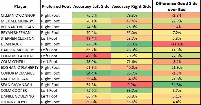
11 of the 16 were better on their more natural side. There is definitely something to look at in terms of the Donegal free-takers. Both seem to really struggle on the wrong side but for someone like Cillian O’Connor it seems to make no difference, he is the best free-taker regardless of the side of the pitch the infraction appears.

In summary I think there is merit in looking at what side of the pitch and what foot the player likes to lose but don’t lose sight of the individuals. It’s not a one size fits all answer.

Cillian O’Connor – Some Context

Yesterday I published some top scorer charts for the last 3 seasons. You can see them at the bottom of this article. I also appended the question can you really still claim Mayo don’t have a marquee forward? Needless to say this got people animated. The general jist was that Cillian O’Connor get’s loads of handy free’s, he doesn’t to it in the big games and if I removed all the early Connacht games I would see something different. So I took a look.

I’m not sure about being this reductionist with the data. But to answer the doubters I said I would take a look. The data looks at just games played in the All Ireland Series (1/4’s onwards) from 2013 – 2015. It takes the actual points scored by that player and what we would expect an ‘average’ inter-county player to score given the same shots. This means that a + number indicates that player scored more than the ‘average’ player would have given the same opportunities and a – number is the opposite.

I am only looking at shots from play – to remove all those ‘handy’ free’s and for ease of viewing I’ve taken the Top 6 and Bottom 6 as a comparison.

Top6-Bottom6-Exp

*Note the ExpP model is based on games I have analysed. In all cases for comparisons between ExpP and Actual Points  I have used the actual points scored in games analysed rather than their season total across all games. 

Better Than Average?

So from this data and based on my model. Cillian O’Connor has added 3.5 points above what an average inter-county forward would get given the same opportunities. Not the Top guy in town but certainly beating a lot of others. In fact when you compare him to some of the names in the Bottom 6, up pop the names of some marquee forwards. It is surprising to find James O’Donoghue here. He has shot worse than the average inter-county forward in these games.

Just to note when we look just at placed ball (excl pens) Cillian O’Connor comes out 2nd. Adding 3.9 above expected.

There is a lot more to forward play than just shooting – but based on these figures I still find it difficult to say that Mayo don’t have a top forward, but I’m sure there are plenty out there who will disagree.

For reference here is the last 3 seasons worth of Top Scorer charts.

Top-Scorer-3-seasons

Player Usage and Squad Sizes 2012 – 2015

As the new season rolls around, no doubt most inter-county managers are busy compiling back-room teams and scouring the county for new talent. This year will see a spate of new managers taking the helm and everyone is keen to impress, promising everyone a fair crack of the whip again. I am interested in how much that change happens at better or worse counties. Or maybe it’s simply that successful teams don’t see to the need to change, as much, as less successful counties. However at what point does all this change mean that building anything sustainable becomes impossible. What about long-term planning?

I wanted to take a look at the size of particular squads and how that might have changed over the last few seasons. Do successful teams have bigger squads or smaller squads? Do they use more or less talent than others?

Data: The data is from 2012 – 2015 and I have used a *sample of counties for illustration. Championship games only.

The first graph shows simply the number of players used by each county in the last 4 years.

Total Players USed 2012-2015


Donegal at the top seems like no surprise, but then look at the 5. Of the last 16 provincial titles available, those 5 teams have won 15 of them!! (Cork won their’s in 2012).

So is squad size really an issue? Is strength in depth as important as we think? Should instead a county be looking to develop a core group of players.

There will be timing issues. Maybe Cork & Tyrone are just at a particular stage in their team’s life-cycle, but it is interesting to note that they have really struggled to be successful on the pitch and in that time have found themselves using 47 and 55 players over the last 4 seasons. When you look at the sheer number of players teams like Antrim, Carlow & Derry have used and consider that these counties do not have long championship seasons it really is staggering to think about that level of player turnover.

Core Players

So perhaps total players doesn’t tell the full story. Mangers might be happy to throw some young players on when a game is won or they know the season is about to end. The next graph looks at Core Players – those that have started at least 1 game (in blue) and those players who have only featured as substitutes (in orange).

squad-sizes-starters-subs-2012-2015


Donegal definitely jump out here as having by far the smallest Core group. Only 25 players have started a game for Donegal since 2012. But again we need to ask – is that important? While the other (successful) counties have used more, it’s not like they have used double the amount. We see a very similar pattern to the first image with some exceptions.

Clare seem to have a core group of 33 players but have use 14 different subs, perhaps suggesting that while the core has remained relatively steady there is high turnover in the fringe players. Wexford and Wicklow look to fall into a similar pattern.

Again Cork and Tyrone seem to have big squads but have also used many different starters and combinations. Hardly the sign of a settled squad or team.

Big Squad v Small Squad

Do successful teams have small squads because they are small or are they small squads because they are successful. That question will take me a little longer to answer but I’m not sure I buy the idea of more is better. Despite all the talk of the importance of a big squad it seems the answer probably lies somewhere in the middle. Getting a good group of core players who you can work with over a consistent period of time, but not so small you burn them out.

McGuinness often spoke of working with teams in a 4 year cycle, similar to Olympic athletes. But how many mangers are given that time? So as managers contemplate shaking things up for the season ahead – they need to ask at what cost does the shake up come?

Teams used in sample: ANTRIM, DERRY, TYRONE, CARLOW, CAVAN, CORK, DOWN, CLARE, KILDARE, ARMAGH, WICKLOW, WEXFORD, MAYO, DUBLIN, MONAGHAN, KERRY, DONEGAL

Why Bernard Brogan Should be Player of the Year

Yesterday I wrote an article about an expected points (ExpP) model I had created for football. This is not a new concept. Dontfoul has a weighting model, there are numerous examples for most field sports and Golf has a strokes gained metric. They all work off the same basic principle. How much better is player X than the average player. Granted this comes with a lot of question’s about who this imaginary average player is, but the results of these models can be fascinating.

As the All Stars list has been announced and the team will be selected along with player of the year there is at lest 3 positions where we don’t have to rely solely on opinion. The forwards. Sure we can turn to the Top scorer chart, but what does that really tell us? The structure of the championship means it is virtually impossible for anybody but a small group of players to win this. Some teams play 7 games while 16 teams will only feature twice.

Here it is anyway. The Top Scoring Chart for 2015

Golden Boot - Final

What is interesting is that we can now compare these players to what the average inter-county player would have scored given the same opportunities. So did Bernard Brogan score 39 points this year because he plays he get’s easy chances, because he is supremely good or a bit of both? Likewise for Cillian O’Connor, his his score total dominated by handy frees?

Below is the top 20 players based on Points above Expected (Shots gained if you are a golf fan).

ExpP 2015 Top 20

Bernard Brogan, not only scored 39 points and won an All Ireland title, but compared to every other player he added 8 points more than the average footballer. To contrast this with his season in 2014 shows the value of these metrics. In 2014 he scored 24 points, not a bad return, and one that puts him in the top 10 scorers for that year. However an average footballer would have scored 27 points given the same opportunities. So in fact that’s a -3 point in 2014.

Same player, in 2 consecutive seasons being in the Top 10 scorers but the numbers telling a very different story.

For reference here is the Top 10 in 2014.

ExpP 2014 Top 10

*Note the ExpP model is based on games I have analysed. In all cases for comparisons between ExpP and Actual Points  I have used the actual points scored in games analysed rather than their season total across all games. 

Expected Points

Football (and Hurling to an even bigger extent) operates in the universe of small numbers. Dublin & Kerry have played each other in just 25 Championship games in the GAA’s 125+ year history. In a very similar period the Yankees have played the Red Sox 2,130 times!! Comparing era’s and teams in that historical rivalry carries much more weight than the one on this island.

Every year football team’s seasons seem to be defined by one or two very small, possible random, events. In 2015 alone there have been some great examples of this;

Westmeath were 8 points down at half-time in a seemingly one-sided Leinster semi-final. Meath capitulated and Westmeath went on to win by 4. The first time the have ever beaten their near rivals. The following day’s papers were full of headlines like; Tom Cribbin’s tough love pays off for Westmeath, following is very public criticism of his players during the national league. This all despite the media being heavily critical of the ‘rant’ at the time, in hindsight it seemed they were happy to change their mind. By most accounts Westmeath’s season was heralded as a success despite one second half performance and going on to only score a further 13 points in their remaining 2 games.

Fermanagh another team being picked as a ‘weaker’ county punching above it’s weight this year, beat Antrim twice, granted had a very good win against an out-of-sorts Roscommon team and had a moral victory against Dublin.

At the other end of the scale Cork had a terrible year, resulting in the resignation of their manager. Despite pushing Kerry to the pin of their collar in Killarney, Kerry required a lucky inspirational point in the dying minutes to force a replay. Cork couldn’t seem to raise themselves for the replay or the qualifier game against Kildare 7 days later.

Dealing in these tiny sample sizes makes it very difficult to separate the signal from the noise. How much of that Westmeath 2nd half display was down to a managerial rant 3 months previous, or tactical changes at the break? Was Fionn Fitzgerald’s point lucky or calm execution of skill honed on the fields in the Kingdom.?

Expected Points (ExpP)

Shots is perhaps the easiest performance characteristic to attempt to separate the signal from the noise. To do this we can examine what the ‘average’ footballer would expect given the same shot location. This metric is similar to those found in most sports. Soccer has expected goal metrics and Basketball has an Expected field goal metric as just 2 examples.

I have broken the pitch into 5 x 5 square zones. Giving 13 zones long and 18 zones wide (234 zones in total). We then take the average return (Scores / Attempts) for each zone and work out what the expected return for the ‘average’ footballer from that zone would be.

expP-pitch-map

Because of the difference between shots from play and placed ball we need to create 2 set’s of ExpP. Actually we create another one for Penalty’s.

Let’s look at an example; Taking a free in front of the goal and on the 21m line (zone 5;8) gives a 100% expected return for the ‘average’ footballer. We would not expect anybody to miss from here. If, hypothetically, a team took 10 frees from this position we would expect them to score 10 points.

If we look at the same zone but from play we would expect the ‘average’ footballer to score 50% of the time. If our hypothetical team took 10 shots from this location we would expect them to score 5 points.

We can plot the shot location of every shot for each team – we add all the expected returns to see what a team was expected to score based on the chances they created.

In any one game a team will score more or less than the ExpP but this is randomness – the ExpP should give us a more accurate reflection of what the true value of the chances created was.

Fionn Fitzgerald

So to bring us back the the Fionn Fitzgerald shot we can look at the true value of that shot. When I plot that shot it goes into zone 9;13. The average return from here is 27%!!. To put this another way; that shot only just over 1 in 4 times.The reason we like sport is because sometimes we don’t know what will happen and there are no second chances under the same conditions. Cometh the hour cometh the man and all that. The shot sails over the bar, Kerry live to fight another day, their manager becomes a tactical genius again and the show moves on. However Cork can count them somewhat unlucky based on that single event. If you pause the game at that point Cork are the overwhelming favourites every-time.

Donegal v Mayo

Let’s take a look at the model on a team level. If we take the recent game between Mayo and Donegal we can see what each team was likely to score based on the chances they created. Dealing with goals presents a slightly different problem than other sports with a success/failure scoring system. If a shot is taken inside the red zone (above) I am making (a possibly unrealistic) assumption that this was a goal scoring chance. For chances in these 12 zones I multiply the expected return x 3 to more accurately account for goal chances. This is not perfect but it’s a start.

Donegal: The model shows Donegal’s ExpP was 13.3 (they scored 11). That’s pretty close. The reason for the over estimation is probably that Donegal had 2 goal-scoring chances with an ExpP of 3.2 but took neither.

Mayo: The model shows Mayo’s ExpP was 17.3 (they scored 19). Again not very far off. The Lee Keegan goal brings the actual above the ExpP. My model assumes this is a shot for a point (as it falls outside the 12 goal scoring zones) so therefore underestimates the ExpP.

Just to check I looked at the Monaghan v Tyrone game.

Monaghan scored 14 (ExpP = 11.7). Shows just how off they were on the day. Even with a bit of luck they fell short.

Tyrone scored 15 (ExpP = 15.9). As good as Tyrone were on another day they could have scored slightly more.

Final Thoughts

This is only a starting point, in no way am I saying this is perfect. But it’s a hell of a lot better than spouting on again about desire and workrate.


It’s a Squad Game

It’s a squad game. Invariably if a team brings on a Sub and he scores a vital point we all hail the strength in depth of a squad. Donegal have too small a squad, the Dubs have an abundance of talent and Kerry’s bench is packed with All Stars. But how do teams use their squad and is there any truth to the cliché that it’s a squad game.

The average Squad size in 2015 is 25. Sure you have some variance. Sligo at 21 and just 8 subs used in their 3 games does seem low. Westmeath & Roscommon top the pile, having used 29 players each in their 4 games. What about the superior 7 counties?

In the first graph you will see that the number of players used is not all that different. Tyrone played 7 games which might explain their high number and Monaghan do look a couple of players short but the others; Cork, Donegal, Dublin, Kerry & Mayo are all very similar.

Squad size 2015

How Are they Used?

Ok so just because a team used X number of players doesn’t mean much on it’s own. The second image shows how many players have started every game and how many have played max game time.

players-used

The stand-out numbers  here is that just 5 Kerry players have started every game. This is half the number for Dublin, Cork, Donegal, Monaghan & Mayo. It really does show how willing Eamonn Fitzmaurice is to change his side from game-to-game (or does he just now know his best 15?). Only Sean Kavanagh played max game time for Tyrone! Tyrone managed to use a lot of different players giving them good game time, starts and still reach a semi-final.

Squad Depth?

What does squad depth really mean? Players used, starts, game-time? Or do we just weave a narrative after the fact?


Dublin Kickout Map

There is so much talk about Dublin’s Kickouts I thought it would be worth sharing some data that people could explore. This visualization contains *some Dublin Kickouts from the last 2 seasons.

*TV companies don’t show all kickout locations, especially at the speed Cluxton kicks it out.

The Dominant Dubs – Kickout Analysis

There can be little argument than Stephen Cluxton has changed what it means to be a goal-keeper. His All-Ireland winning free taking aside his skills from the kicking tee, picking out runners with an accuracy previously unseen, have changed the role completely. So how dominant are Dublin at Kickouts?

Dublin Kickouts – Winning %

Dub-Kickouts-Own

  • Since 2011, in 22 Championship games, Dublin have only had 3 games below the national average.
  • Only once have they lost more than they have won – Kerry 2011
  • 69% is there worst performance in the last 2 campaigns.
  • Last season teams at best won 1/4 of Dublin’s Kickouts.

Opposition Kickouts v Dublin

They are many games where Dublin kick the ball out a lot less than their opponents. So how do they fair when facing opposition Kickouts

Dub-Kickouts-Opp

  •  As you can clearly see – teams struggle. Laois winning just 25% of their own kickouts in 2012 is a stand-out.
  • Only 10 out of 22 games have the opposition beaten the average of 60%
  • Some teams have done quite well, noticeably Mayo (2013) & Laois (2014) but those big performances are few and far between.

While their dominance on their own kickouts is something of considerably note – it shouldn’t be underestimated how effective they are at stopping the opposition securing primary possession. Gives an idea of the task facing opposition teams visiting Croke Park.

The Death of Gaelic Football – Fact from Fiction

There is only one way to play football – like it was played in the good old days. When were those good old days – and what were was the game actually like? As has become custom, there is plenty of discussion about the death of football. Hand passing, cynical fouling and blanket defences are the problem. Perhaps amazingly Joe Brolly would like Mickey Harte (and every other manager) to entertain the masses. Yes Inter-County Football is essentially an entertainment product but it’s not Mickey or Jim or Rory’s responsibility to entertain is it?

I’m sure Brolly is not adverse to the limitations of eye-witness testimony and it is worrying that he commands such an audience and bases his thoughts on the current game on his own eye-witness testimony. Tainted by every conceivable bias and very strong beliefs that there is simply only one way to play football, he is dealing in opinion rather than facts, which is his prerogative I suppose.

I wanted to look at the facts. Let’s deal with the death of football and see what that looks like – maybe we can even come up with some ways to fix this dreadful game!

Let’s start at the most basic of points. Scoring is UP

  • Championship 2014 was the highest scoring championship ever.

Ok that cheats a bit – there are more games than ever. But it’s the highest scoring championship since the qualifiers. So how about average scores in Championship games since 1970. It still UP.

average-points-per-game-championship

If football was truly getting too defensive wouldn’t you expect to see scores decreasing? Instead we find ourselves not just with the highest scoring Championship ever but the highest average per game.But maybe scoring is not entertaining?

What about winning margins. No Change!

avg-winning-margin

So we have the highest scoring championship – and again despite the rhetoric the gap between winners and losers is growing. It was the same in 2014 as it was in 1970 and has fluctuated wildly in between 4 – 9 for the last 40+ years.

Not all scores are created equally. Just because scoring is up that tells us nothing about what type of scores. Surely now there is a bigger % being scored from free than from play? My database doesn’t break this down for every game, however we can work with samples(televised games). Looking at games from the last 3 years (league games and at least 500 scores per year) we can see the breakdown of scores.

score-breakdown-league

From this we can see that the breakdown of scores has changed – is it a dramatic change? I will leave that for you to judge.

What about Championship games?

score-breakdown-championship

More scores came from play in 2014 than the previous 3 years. These are very minor changes – but hardly a signal for the death of football?

Other Facts

Is hand passing up? YES

Is foot passing down? YES

Is Shooting up? Yes

Did the number of fouls decrease in 2014? YES

Did ball in play time increase? YES

I have no issue with what direction the game takes – that is up to higher powers than me. You might not like hand passing and what to see more high-fielding and that’s fine. My argument is please be clear what you mean by the death of football. Is it just the style you don’t like? That’s a very subjective opinion to hang the future of a sport on. Any analysis of where the game is at and monitoring its future should at least look at the facts and not just rely on eye-witness testimony.

The death of football looks distinctly like it’s past!